


Define
Goal Statement
Our website for Gianna Michele Photography will let users shop for and purchase photography merchandise online, which will affect customers of GM Photography and those who follow her on social media by allowing customers to learn more about her, her brand, and gather information about her photographs so that they can make an informed decision and purchase her photography items. We will measure effectiveness by tracking traffic to the website and orders placed, and reading customer reviews.
Competitive Audit
Before moving into the ideation phase, it was vital to understand how our photography website could fit into the existing space of photography websites. Thus, I needed to perform a competitive audit to adequately determine our product's value proposition.
Opportunities
Insights were gathered from the competitive audit report about the gaps present with other competitors and the opportunities that could fill those gaps. The following opportunities were uncovered:
Photo Captions: Provide photo captions that give customers key information on the photograph and the though process behind the shot

Purchase items
Integrate a shopping section on the website that allows customers to add items to a cart and checkout on the website

Organize Gallery
Create subcategories to better organize photo gallery. Accompany subcategories with photos to act as visual cues on what type of content they should expect on that page

Keyword Search
Consider having a keyword search function for customers to more easily find the photo they are looking for

Ideate Solutions
User Flow Map, Storyboards, and More
A number of tools were used in the ideation phase to create and build upon ideas. This included making a user flow map, storyboards, designing information architecture for the website, and completing the crazy 8s exercise. The information I gathered from these steps aided in the process of creating the paper wireframes.


From Low to High Fidelity
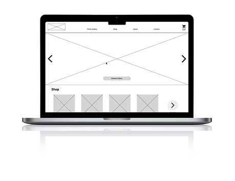
Proposed Solution
My proposed solution for the client was informed by extensive foundational research about the company and their competitors. This led me to the ideation phase and mapping out viable solutions based on the problem statement and user pain points that I identified.
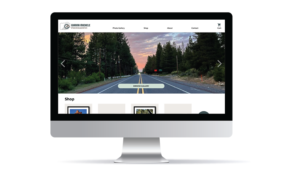
The first attempt to solving this UX problem involved designing a layout that centered around the photographer's artwork. I decided the best approach would be to keep the design simple, with lots of white space, so that it didn't distract users from the photographer's work. I also needed to focus the website with 2 main priorities in mind: showcase the photographer's work in the form of a gallery, and encouraging customers to purchase photography merchandise.
Going Forward
Limitations & Constraints
One main limitation in the project was that of time. Tiny Steps Day Care is hoping to open soon and the owner wanted the website to be up and running so that parents can place their child on the waitlist prior to opening their facility. Due to this, I prioritized the overall look and functionality of the website with the ability to build upon specific feature in the future.
Another limitation is that my final design has not been tested. If I had more time to work on the project, I would run a usability test with participants to see whether specific features of the website work as intended and how the overall design fits with customer expectations.
Improvements Going Forward
Product Description Page (PDP)
Another area for eventual improvement could be the product description page (PDP). Specifically in the way the customization options are displayed on this page for size, paper option, framing, etc. These selections could be made more accessible by accompanying the options with pictures. The buttons could also be distinguished from one another to provide better visual cues for the different categories.
Further User Testing
Once the finalized designs are live on the website, further usability testing is recommended to see how users respond to the finalized product. A sample size of users helped to guide our research into what features users want, but ultimately more testing would need to be done to see how customers of Gianna Michele Photography like the design and implementation. Customer surveys could be one tool used to measure impact and user satisfaction.
Design Impact & Considerations
Business Impact
Customers of Gianna Michele Photography now have a website where they can view gallery items, learn about the photographer, and purchase items with ease. There is a built-in checkout that provides users the most efficient path through main user tasks. The business impact of this feature is that it will now allow one to make purchases online, ultimately leading to an increase in sales.
Design Impact
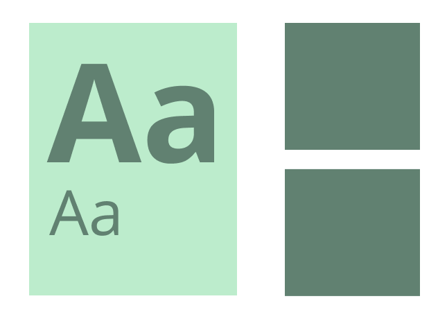
From a design impact perspective, I have helped build up the company's design documentation by creating the style guidelines for color, typography, and iconography. Additionally, the company now has a large amount of foundational research about users, competitors, and results about user preferences from usability studies completed, which they can build upon in the future.
Project Highlights
Extensive User Research
The client and I wanted to ensure their website was competitive with other local photographers. To do this I needed to come up with feasible solutions that adequately pinpointed the pain points of users. As such, foundational research about the user, the company, and their competitors was crucial in this project. This included generating and compiling information from things such as: surveys and interviews, personas, aggregated empathy maps, user stories, a user journey map, problem and goal statements, a competitive audit and report, a user flow map, affinity mapping, and usability studies.


Interaction Design of Images
One notable feature was the way in which the photo captions were designed. Photos have text descriptions that slide in from the bottom when hovering over the image. This feature enhances one's experience using the website because it allows one to view an image in its entirety, while also giving users the option to read and learn more about the photographs. As previously mentioned, this feature is also an accessibility feature for screen readers.

Solution

From paper wireframes to low and high fidelity designs, each stage of the process helped to solve the UX issues that were laid out in the beginning of the project. Some techniques that made this design successful include:
Captioned photos: A support pain point identified in my research was that individuals wanted more information about a photograph, especially before purchasing it from a photographer. Whether found on the product description page, or captioned underneath photos, I included a number of areas where users can learn about an item. This also acts as an accessibility measure so that screen readers have text descriptions alongside photos.
Functional layout: I didn't want the design to be too busy and take away from the photographer's amazing work. As such, I pared down the information to only include what is most crucial in order for users to find the information and pages they need. Each UI and graphic element needed to have a function. This approach also helped to ensure the user flow was concise.
Thoughtful color selection: One design decision made was to keep the vibrancy of colors on the website to a minimum. Similar to the reasoning for the layout of the website, I chose to do this so that it didn't pull too much attention away from the photographer's work. Instead I used more muted tones and minimized the number of colors I used in the palette.
Usability Study Findings & Insights
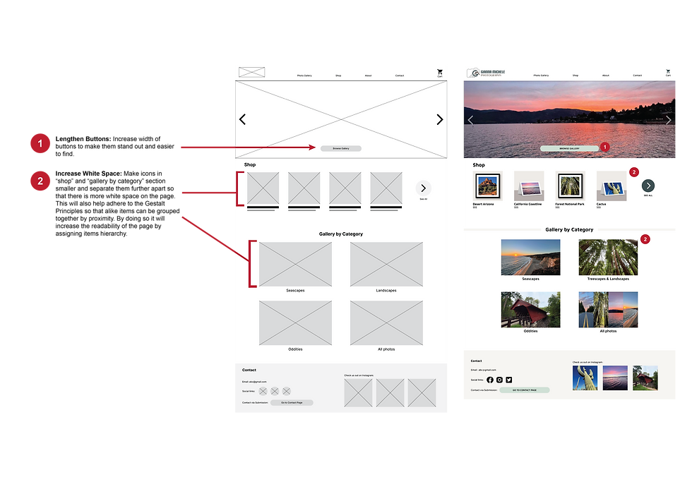
As a whole users had an easy time navigating the website, finding items, and making purchases. Although, a few participants pointed out an issue on the product description page where one was unable to customize their order or see pricing. Ultimately this issue needed to be addressed and was marked as a P0 insight, as it directly effects one's ability to make purchases and complete a core user task. One section on the homepage also needed to be altered, but this insight was less urgent and marked as a P1 insight. Visually the "shop" and "gallery" sections look too close together and need to be separated using the Gestalt Principles.
1
PRODUCT DESCRIPTION PAGE (P0)
The PDP should be updated with more thorough information and customization options
2
HOMEPAGE (P1)
The Gestalt Principles should be implemented to ensure the "shop" and "gallery" sections are not cluttered
3
ALTERNATIVE USER FLOW (P2)
Adjust website so that it makes both user flows more efficient: those looking to purchase items vs those viewing the gallery
4
CHECKOUT PAGE (P2)
Modify checkout to encourage users to stay on the page and complete purchases before browsing the rest of the site


Understanding The User
Foundational Research
I met with the client to establish a design brief and to gather information about them, their company and branding, and the requirements for their project. Once I had a good understanding of the scope of the project, it was time to conduct foundational research that would help me better understand the type of customers that would be using the website and purchasing products. My research started with a short 1-2 minute survey to pre-screen interview candidates and ensure those selected for the interviews were broadly interested in photography, photographer's content on social media, and having either previously purchased or be open to the idea of purchasing photography merchandise from a photographer.
From the survey, I gathered a group of 6 individuals who qualified for the interview. The interview was approximately 10 minutes in length and aimed at figuring out what customers want to see on a photographer's website as well as the way individuals search for and purchase photography products online.
Aggregated Empathy Maps
I was able to identify 2 unique types of users from the individuals interviewed. As such, I decided to move forward with creating aggregated empathy maps that would take the collective responses I received and sort them into two main user groups. These user groups, termed "Participant A" and "Participant B", are pictured below:


Project Overview
Product Duration: August 10, 2022- September 18, 2022

Job Type, Company: Contract position, Gianna Michele Photography

My Role: Lead UX Designer, Graphic Designer
-
User research: Creating problem & goal statements, user stories, aggregated empathy maps & personas, user journey mapping, and user flow mapping
-
Competitive audit and report
-
Creation of research plan
-
Conducted usability study and analyzed data to make insights about changes
-
Wireframing & prototyping (low & high fidelity)
-
Branding and logo design
-
Established design system in line with the brand
My Key Contributions
The Problem
Gianna Michele Photography currently doesn’t have a website to sell her photography products. The store section must be organized by product type as well as sub-categorized with the style of photographs.
The Goal
Create a desktop website design for Gianna Michele Photography that allows her clients to browse her work as well as purchase various types of photography products.
Low to High Fidelity
Accessibility Considerations

Color Contrast: As per the WebAIM color contrast requirements, all background and foreground colors meet this standard. All fonts also meet these accessibility requirements of being 7:1 for normal text and 4.5:1 for large text and icons.

Text to aid images: Seeing as this website largely relies on visuals, I included hover over text descriptions below images in the gallery. This will help screen readers easily identify the contents of images. This implementation of inclusive design helps those wanting more information on an image, but also extends to helping those with visual impairments who rely on screen readers.
Hierarchical Content: By following the Gestalt Principles, I was able to make intentional design decisions that ensure optimal readability of the website. Hierarchical headings and following the rule of proximity to separate sections were two of the most used Gestalt Principles I used. These features help make the design inclusive by making the page less cluttered and more organized and legible.
Contact
I'm always looking for new and exciting opportunities. Let's connect!
650-695-9210
Pain Points
The aggregated empathy maps represent a group of users who share similar thoughts, opinions, and qualities. I used both these user groups to identify potential pain points these groups have. These pain points include:
-
Process: finding photographers online and subsequently finding their website to purchase art
-
Support: wanting questions answered about the photograph, the persons biographical info and background
Personas
Using the empathy maps and the pain points that were identified, I crafted fictitious personas that matched each user group. From that I created user stories to further understand the user and their needs.


User Journey Maps
These user stories helped to prioritize the design goals and inspire empathetic design decisions by putting oneself into the shoes of the user. To further this type of thinking, the next step was to make user journey maps. By imagining the path a user may need to take to accomplish their goals on the website, one can highlight new pain points, identify improvement opportunities, and make an obstacle-free path for users.


Summary: Understanding the User
Through user research and interviews, two main user groups were uncovered based on their similar attributes and user needs. There are those looking to learn more about a photographer and get attached to their work before purchasing products, and those that have been following the photographer on social media and primarily want to use the website to make purchases. This research helped give insight into what users are looking for in a photography website. As well, the research helped me empathize with users to understand the unique user journey they may take to accomplish tasks. This will aid in the next part of the process as I look to define the product users want and need.